Making eLearning Accessible
eLearning is convenient. It’s flexible in time and place and is a perfect solution for just-in-time learning. However, without a facilitator to swiftly adapt their approach on-the-spot to meet learner needs, it’s critical that we design eLearning in a way that caters for diverse learners. This starts with making learning accessible.
What is accessible eLearning?
Accessible eLearning means that all learners can access the content and participate in activities and experiences, regardless of their needs. This means a program that caters for people with disabilities – including visual, auditory, or mobility disabilities who may be using assistive technology.
How can I make eLearning more accessible?
The Web Content Accessibility Guidelines (WCAG) 2.0 provide recommendations for making eLearning more accessible [1]. While eLearning authoring tools are continually updated to improve accessibility, it’s important to be aware of features that are not accessible to screen reader users and keyboard-only users. Other features may also require an eLearning developer to take further actions to make interactions accessible. For example, although an image can be an accessible feature, the developer must add alternative (‘alt’) text to make it accessible for learners using screen readers.
Rise 360 continues to enhance its software to increase accessibility. The results from a Voluntary Product Accessibility Template® are available here Rise 360 Accessibility Conformance Report [2]. There is also a range of accessible features currently in development, which are listed in the Articulate 360 Feature Roadmap [3].
So – how can you make the most of what Rise 360 has to offer, whilst ensuring that your program is accessible?
Explain how to navigate the course
Although Rise 360 is quite intuitive, it doesn’t hurt to highlight the key navigational tools upfront, before the learner dives in. This includes how to zoom-in on an image, use the search bar, navigate using the menu and turn on closed captions in a video. It is also handy to draw attention to labelled graphic buttons, continue dividers, flashcards and other interactive elements to look out for.
Provide a simple instruction before each interaction throughout the course for learners. Use bold text, italics or a different coloured font to differentiate between content and an instruction.
Use an accessible font and colour palette
Ensure that you use a font that’s easy to read, such as Calibri or Arial. The colour contrasts should also be compliant with accessibility requirements. There are online tools, such as WebAIM’s Contrast Checker that can help you to measure contrast ratios [4].
Design accessible content
Keep language clear and concise, and avoid using jargon or complicated vocabulary.
Present content in a cohesive way, using images and graphics where appropriate to reinforce concepts and deepen understanding.
Use ‘alt’ text to describe graphics, photos, charts and diagrams. If images are decorative, you still need to note this in the alt text by typing “”.
Add closed captions to all videos and provide transcripts for audio files.
Design accessible interactions
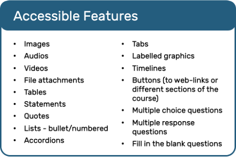
Know which interactions are accessible, and those that aren’t. We’ve put together a list of Rise 360’s accessible features below.
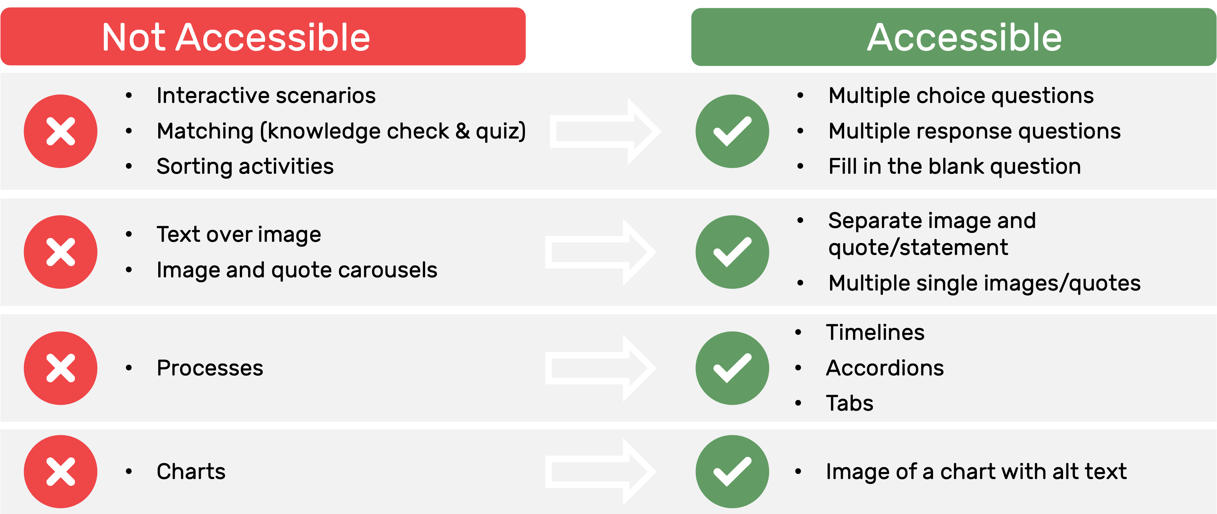
You can easily modify content or interactions that aren’t accessible. For example, drag-and-drop features such as matching and sorting activities that aren’t accessible can be replaced with multiple choice, multiple response and fill-in-the-blank questions.
Here are some ideas for making your Rise 360 program more accessible:
Ensure that resources are accessible
Don’t get caught out by creating accessible eLearning with inaccessible resources! Make sure any workbooks, job aids, post-workshop activity books and other additional resources also cater for all learners.
Approach to accessible eLearning
You’ll often find that not all interactive elements authoring tools offer are accessible. To get the most value out of the features, it’s worth considering developing two versions of the eLearning program – one of high interactivity, and another of high accessibility. This way, learners can select the version that best suits their needs.
Final thoughts
Whether you’re developing accessible eLearning or a different learning solution altogether, keep the learner front-of-mind to set them up for success!
References:
[1] The World Wide Web Consortium [W3C] (2008). Web Content Accessibility Guidelines (WCAG) 2.0: W3C Recommendation 11 December 2008. Retrieved from https://www.w3.org/TR/WCAG20/
[2] Articulate 360 (Updated 30 December 2020). Rise 360 Accessibility Conformance Report. Retrieved from https://articulate.com/support/article/Rise-360-Accessibility-Conformance-Report-VPAT
[3] Articulate 360 (Updated 3 March 2022). Articulate 360 Feature Roadmap. Retrieved from https://articulate.com/support/article/Articulate-360-Feature-Roadmap
[4] WebAIM (n.d.). Contrast Checker. Retrieved from https://webaim.org/resources/contrastchecker/
Relevant articles:
- Blended Learning
- How To Sell eLearning Courses
- Do You Want to Create an Online Course or eLearning?
- How much does it cost to create eLearning
- eLearning: Dos and Don’ts


